June 24, 2022 at 4:35 pm
#69053
https://www.buchstabentraum.de
Thanks for your fast reaction.
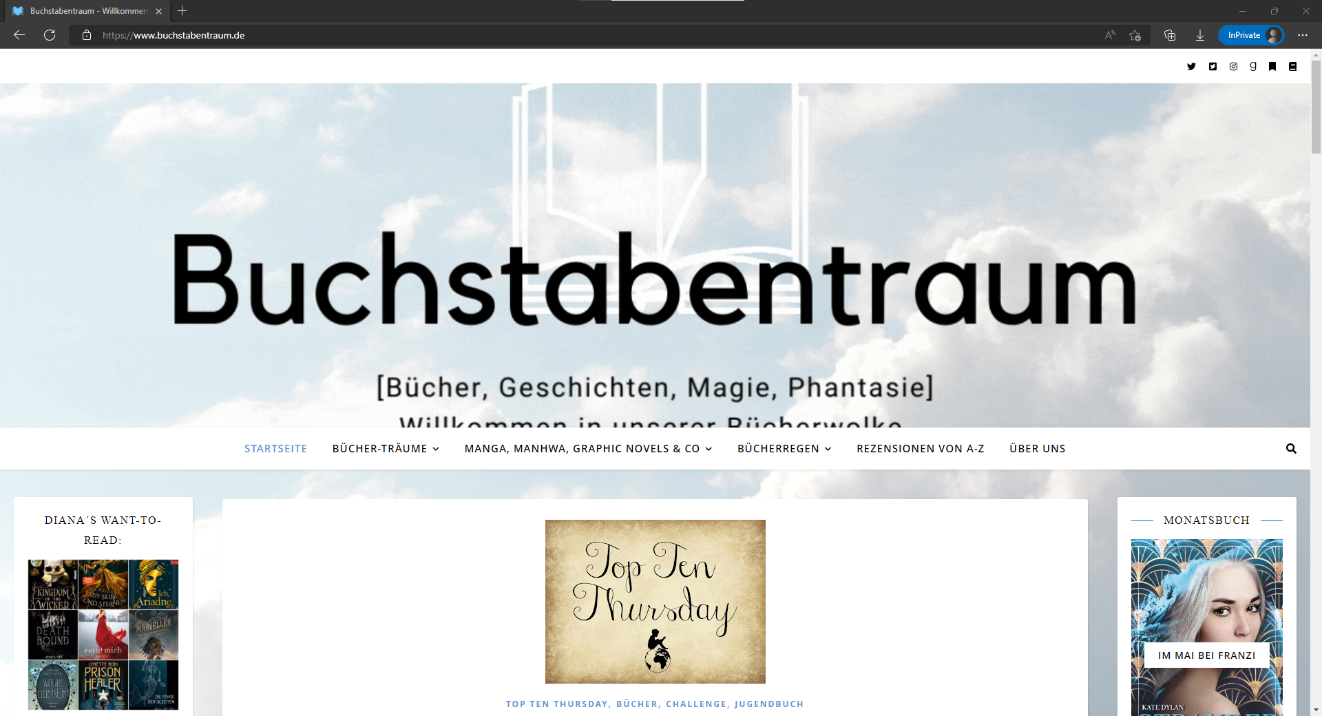
Every header we use on our homepage is shown differently on different screens. For example the header is perfectly shown on the mobile screen and a small laptop screen, while on a bigger laptop screen or a PC screen the header is zoomed and cut off. You can see it at the screenshots we take from a mobile screen, a laptop and a PC screen.
https://www.buchstabentraum.de/wp-content/uploads/2022/06/Screenshot-Header-PC.png
https://www.buchstabentraum.de/wp-content/uploads/2022/06/Screenshot-New-Header-iPhone.png
https://www.buchstabentraum.de/wp-content/uploads/2022/06/Screenshot-New-Header-Laptop.jpeg
Hope you can help us. Thanks in advance.